top of page
TIAAN SCHUTTE
I am a passionate graphic designer with a remarkable
16-year journey in the realm of creative expression.
My expertise spans a diverse range of media and platforms, allowing me to breathe life into visions, connect with audiences, and craft impactful visual narratives.

a de
sign
forlife
Contact: tiaan817@gmail.com, 082 493 7049
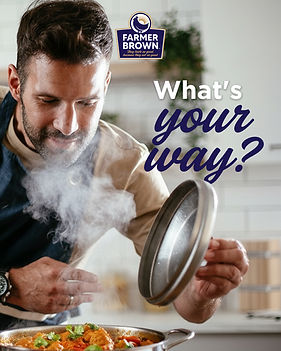
Farmer Brown
Social Media Story


Social Media Posts


Ultra Liquors


Michelle Ori
Product packaging and label design


de terra tea box design


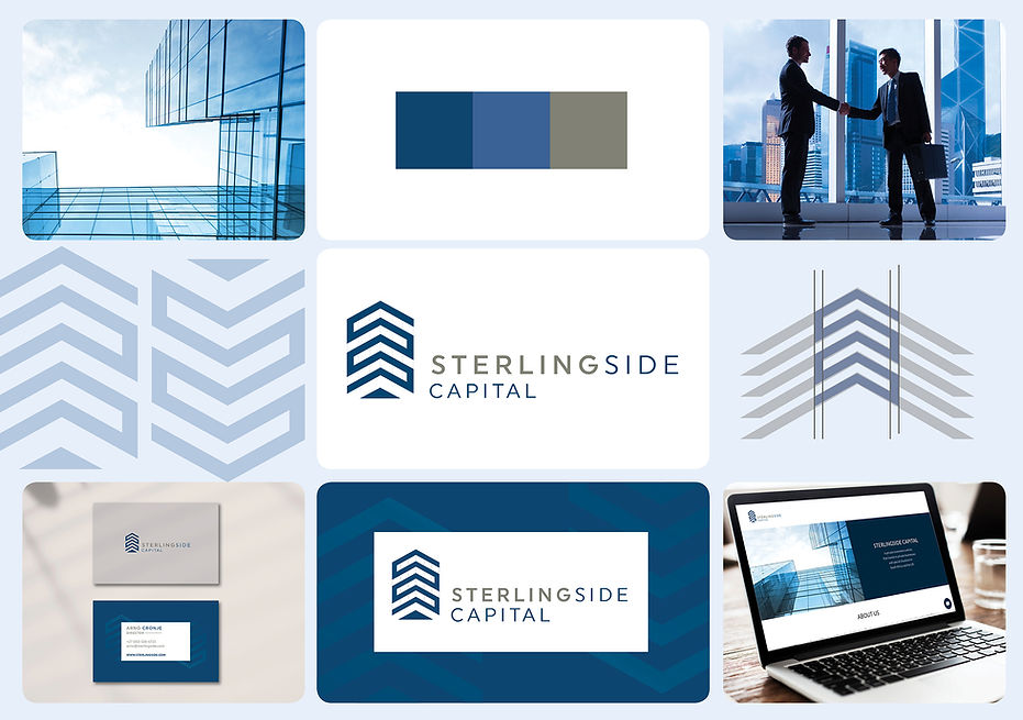
Sterling Side Capital Logo
Stearlingside Capital was born out of a vision to redefine clarity and strength in the world of investments. I wanted the brand to evoke both ambition and trust, so when designing the logo, I drew inspiration from high-rise buildings—symbols of progress and resilience. At the same time, the stacked elements in the design reflect the layered, strategic nature of wealth-building. Choosing the right color was just as intentional: a striking, crisp blue that immediately signals professionalism, stability, and confidence. From the very beginning, every element of Stearlingside Capital was created to represent growth with precision.
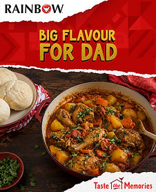
Rainbow Chicken
My ongoing work with the Rainbow Chicken brand includes developing a variety of creative materials such as posters, magazines, social media content and mailers. The brand’s lively and playful CI provides a great foundation for creating a brand that speaks to it's audience.
Social Media Carousel


Posters and Mailers


Social Media Story


Time Transport Logo
For the Time Transport logo, I combined a clock and speedometer to symbolize speed, precision, and reliability. The design is bold and simple, making it eye-catching while reinforcing the brand’s focus on timely service.

-02.png)
-01.png)
Heritage Competition
I entered the Takealot Heritage competition as a fun side project. I really enjoyed the theme and loved creating something playful and vibrant that celebrates South Africa’s rainbow heritage. The winners design was printed on Takealot boxes.


Working on food campaigns for Freshline Spar at Caxton Studio and contributing to Food&Home magazine was a very rewarding experience. I art directed and organised shoots, ensuring the visuals aligned with the brand’s messaging and target audience. Creating content across print and social media required both creative direction and a strong understanding of how to engage consumers effectively.
Spar Freshline


I curated each page of Wedding Inspirations magazine to evoke sophistication and charm. The typography is a blend of elegant serif and playful script fonts, creating a harmonious dance between tradition and modernity. Clear and spacious layouts guide readers through the content, with ample white space allowing images and text to breathe.
Wedding Inspirations Magazine
The tagline "Love is a four-legged word" struck a chord within me. It encapsulated the profound connection we share with our furry companions – a bond that often defies words. This simple yet powerful phrase perfectly set the tone for this digital campaign which consisted of website banners, social media posts and print.
Spar Pro-Balance


Avon Anew
The Anew Skincare Range is all about transformation, renewal, and the promise of a rejuvenated complexion. The design captures the essence of innovation, science, and the delicate balance between nature and technology.


Aspire Gift Box Design
For the centerpiece of this packaging I used an artistic and abstract city scape illustration, rendered in a vibrant shade of gold. This city scape represents the urban energy and determination of the Aspire woman. The gold and the red lends an element of sophistication.

Final logo on the left, initial concept above. The logo features an silhouette of a confident woman in a powerful pose, that I created in a way that emphasizes her ethnic identity, symbolizing progress and empowerment. Her stance exudes strength and determination, capturing the essence of the event's theme.


Cleo Magazine
I designed Cleo Magazine to capture the essence of youthful energy, curiosity, and self-expression while maintaining an air of sophistication. The design balances vibrant and playful elements with a touch of refined elegance.

Unleash Your Power Conference Logo

Product styling
My journey in product styling has been marked by a keen eye for detail, a passion for aesthetics, and an innate ability to craft compelling narratives through visuals. Collaborating with Cleo magazine allowed me to synergize my skills with their dynamic vision, resulting in images that effortlessly caught the eye and ignited curiosity.

The big idea: Bic pens are the best. A powerful sketch of the Johannesburg skyline emerges, with one significant change – a BIC pen towers above the rest of the buildings, symbolizing the superiority of BIC pens in the world of writing instruments.
BIC Ad

The Wedding Expo
I designed a billboard for The Wedding Expo that masterfully balances simplicity and striking impact. Our design captures the essence of love and celebration while swiftly conveying the event's message.


Amuse Website
My design concept draws inspiration from the fluidity and sophistication that characterize Amuse Events' approach to event organization. Imagine a website that flows seamlessly, guiding visitors through the intricacies of event planning with a sense of ease and charm.

Strobing E-Card
I Designed and illustrated a guide that demystifies the art of "strobing" for my make-up client Michelle Ori. My aim was to provide viewers with a visually engaging and informative journey into the world of strobing.

De'Longhi Campaign
“Calling all food enthusiasts and home cooks! Get ready to revolutionize your kitchen with the De’Longhi Multifry.” I created this animated social media post for Food&Home magazine as part of a wider campaign promoting the new De’Longhi Multifry. The campaign included a competition to win the product, with all images styled by me to bring the brand and content to life.
Knorr Recipe Video
"Embrace a Greener, Healthier Tomorrow!" This recipe video was directed and edited by my, created for the Knorr "Future 50 Foods: campaign.
Logo for Moz Advertising
I created the Moz Advertising logo to effortlessly blends the vibrancy of bold red shades with a playful and comical elements, capturing the essence of the brand's focus on classified ads. This logo is a visual representation of Moz Advertising's unique identity.

Black Ad
The big idea, "Black is the new black". Client wanted to promote his black nail polish so I used captivating background in deep black that sets the stage for the stunning black nail polish. The contrast creates a dramatic effect that's impossible to ignore. The bold use of typography immediately draws the eye in.

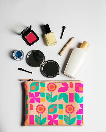
Playful Pattern
I created a playful, eye-catching pattern for a cosmetic bag design, incorporating bold colours and beauty-inspired elements to enhance visual appeal and attract the target customer.
![Final Pattern [Converted]-01.jpg](https://static.wixstatic.com/media/472b55_6464ec895868459988f437e0df5956a0~mv2.jpg/v1/fill/w_665,h_293,al_c,q_80,usm_0.66_1.00_0.01,enc_avif,quality_auto/Final%20Pattern%20%5BConverted%5D-01.jpg)

bottom of page